- Our Products
- Colour
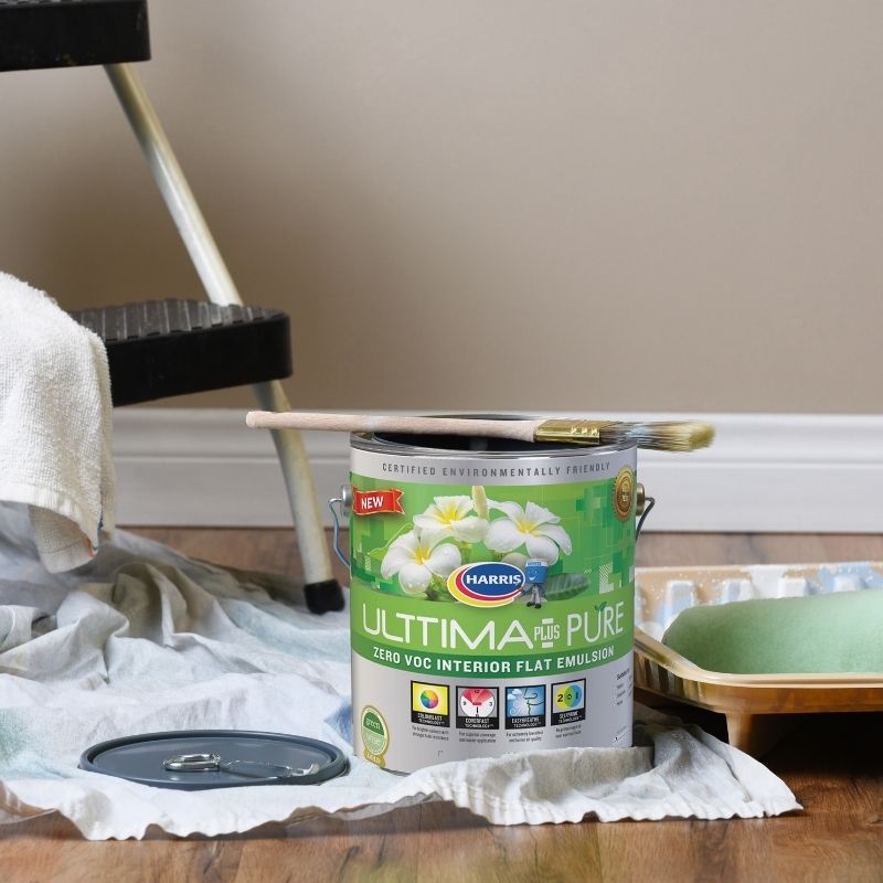
- About Harris & BH Paints
- Our Locations
- Contact Us
- Blog
- Professionals
- Current Promotions
- Find a Location
- Join Our Team
- Login


The colour wheel is an essential decorating tool. Use it to create a synergy between the colours you like and colours that harmonise with them.

The colours that appear beside blue, green and violet are cool. With associations to the sea, sky and sheltering foliage they can be used to good effect in rooms that call for relaxation and calm, such as bedrooms, bathrooms and workspaces. Cool colours are recessive and create an illusion of pushing back walls, thereby making a small room look larger. Use cool colours in sunny rooms to counterbalance the effects of direct sun light.
The colour wheel can be divided in half, with warm colours on one side and cool colours on the other. Reds, yellows and oranges are universally associated with the warmth of the sun and fire and naturally heat up a room. These colours are a good choice for kitchens, dining rooms, living rooms, and playrooms. Warm colours tend to ‘advance’ and can make rooms appear smaller, this makes them ideal for making larger spaces feel more cosy.


Colour harmony helps you choose colours that will not only look good but that will feel good too. To achieve the best harmony, include the colours of your furnishings and accessories alongside your paint.

The simplest of harmonies, monochromatic schemes use various tints, tones and shades from the same hue.

A complementary scheme uses colours that appear directly opposite or nearly opposite on the colour wheel.

A triadic scheme includes any three equally spaced colours on the colour wheel.

A blended scheme incorporating two or more colours that sit side by side on the colour wheel.

A split-complementary combination is one colour paired with two colours on either side of the original colour’s direct complement.

Double complementary harmonies feature two sets of complementary colours that sit next to and across from each other on the colour wheel.
Subtle and sophisticated, a monochromatic scheme is a great way to bring interest into a small kitchen. Here, base cabinets in a white with a hint of blue harmonise with a mid-blue wall feature and a splash of a stronger blue as an accent to furniture.
Colours Used:


Once you recognize a complementary pair, you’ll spot them everywhere in art and design. If this inspires you, a double complementary is a striking scheme for a simple four colour mural. Use decorator’s tape for your design and make sure to let each layer dry before beginning the next.
Colours Used:
If an all-pink bedroom scheme feels too saccharine sweet, or you’re looking to create a more grown-up mood, just bring in some green to complement the pink. Bed linen in fresh white and featuring both colours brings the whole scheme together.
Colours Used:


Choosing colours that sit next to each other on a colour wheel is a stylish way to connect individual spaces. But there’s one place in the home where the continued flow of an analogous group makes this harmony the perfect choice, and that’s on painted stair treads or spindles.
Colours Used:


Looking for more inspiration? Check out the full Inspiring Colour 2021 magazine. You can download the full PDF using this link here.